Design is always changing and evolving, and keeping up with all the trends can be a lot.
Recently, design has been all about individuality.
Making a statement, and never blending in.
Bold typography
Fonts can make a world of difference in your design.
Headers need to stand out and grab the reader's attention, so what better way to do it than with bold typography?
Using large, oversized text has become incredibly popular this year.
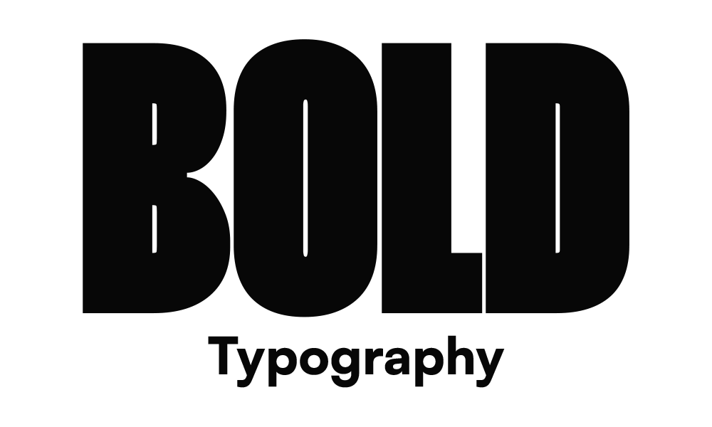
Bold texts have gone from being a way to get a message across, to an integrated part of graphic design.
The text being included within the design is becoming a common practice, it brings whole new energy to your headers and pages.
When you merge your images/graphics with your text, the main issue is maintaining readability.
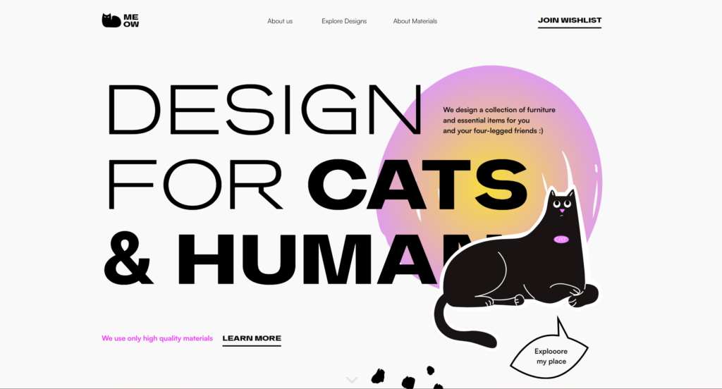
A great example of this is Meow, who has combined bold text into their header design while still keeping it readable! (Plus, any cat owner knows that your furry friend resting in inconvenient spots isn't a surprise.)
Brutalism
Brutalism may still be too brutal (we know) for most.
The design concept in itself isn't used commonly, but so many design trends are derived from brutalism.
Brutalism strives to look raw, unprocessed, harsh, and haphazard.
An almost honest form of web design, it goes against the norm of formality, softness, and friendliness you see in common web design.
One aspect of brutalism that has been taken and reformed is minimalism, the lack of imagery, and text-heavy pages especially.
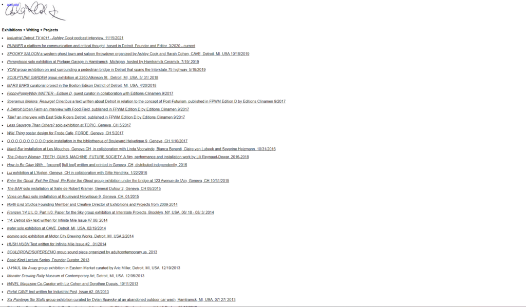
Above is an example of a brutalist website, called Ashley Cook.
Another trend derived from brutalism is breaking out of the grid.
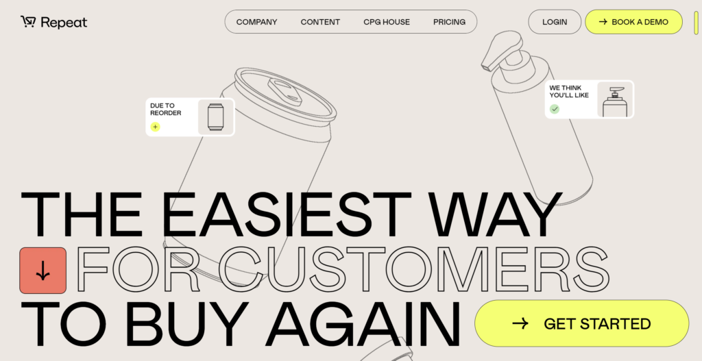
The use of floating images especially takes away a bit of the same-old vibe many websites have, making things a bit unconventional, it all comes down to individuality.
Once you lose the grid and containers, things can get a bit messy, but with the right balance and testing, it can be a really interesting and positive experience for the user.
The website for Repeat uses floating images that are also animated, giving the user a turbulent, but still aesthetically pleasing and interesting viewing experience.
Micro-interactions
Having interactive aspects on your website isn't a new concept but can sometimes be overwhelming for a user.
If every time you move your mouse, something changes or moves, it can get a bit much for the eyes and negatively affect UX.
On the other hand, having interactive aspects makes a website feel much more fun and fluid, it almost personalises the experience for the user.
So, how have web designers got around this issue?
Micro-interactions!
It's the perfect balance between the two extremes, and you probably see it every day without realising it.
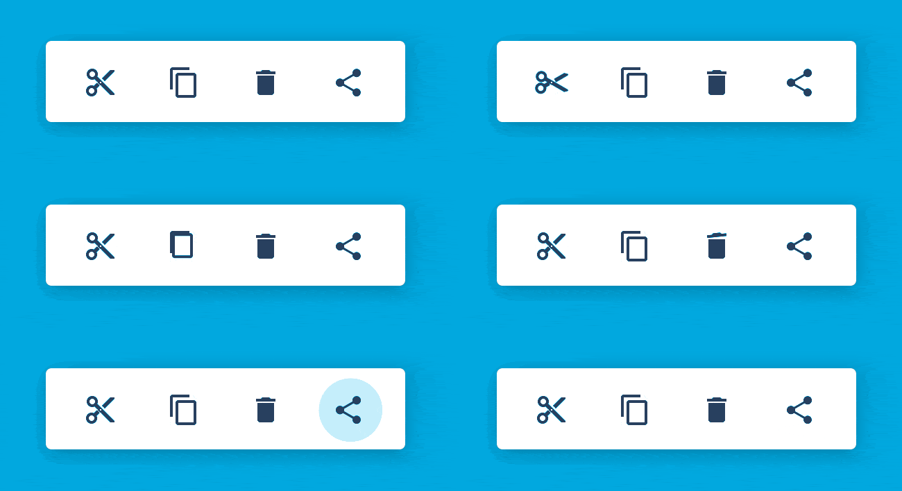
Most commonly, you will see micro-interactions while your cursor hovers over a button of some sort.
It can be a slight change in colour, small movements, icon animation, or anything you want.
At the end of the day, it adds a little bit of fun and life to your web pages, without being too 'in your face'.
Simplicity is sometimes the way to go.
No matter the kind of website you want for your business, PageNorth can help.
Get in touch with our team and see how we can help you.