Share this article
When viewing a website, people don’t immediately read all of the content.
Instead, our eyes dart around the screen, looking for something to grab your attention and starting from there.
When designing a webpage, you should consider this and make the design scannable.
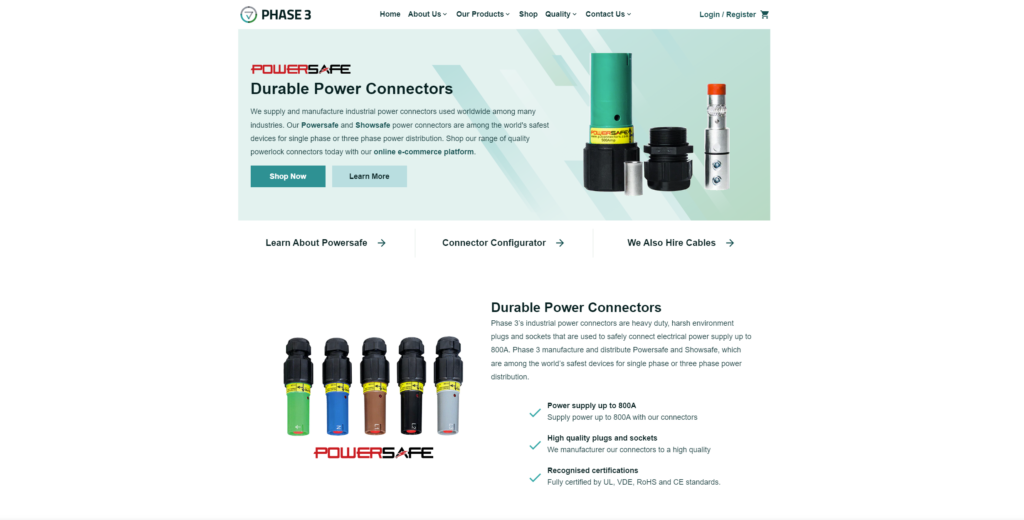
Make the page’s purpose clear at first glance
When the user first clicks on a page, you want them to be able to distinguish what they are looking at quickly.
Often this will be a CTA of some sort, but the page content should be clear from above the fold.
This can be done with imagery, icons, or bold text.
If a user doesn’t know what they are looking at, they are less inclined to stay on the page and explore.
Using a search engine is just shouting a question into the void, so when your website is shown as an answer, they expect the answer immediately, or a sign that you do have the answer at all.
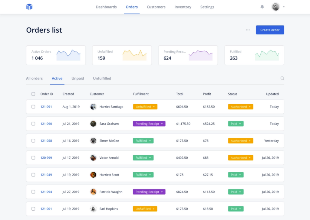
Use lists
A list is a natural way for you to scan through a larger body of content, as the paragraphs can be skipped, and list titles focused on.
This helps the reader find the information they want and are looking for.
It organises the data clearly and keeps it segmented, quick, and easy to consume!
Numbered lists can also help with this, as the numbers show progression through the content.
Implement a visual hierarchy
A visual hierarchy will use things such as font size, boldness, underlining, and other methods to establish importance within text.
It will help with the impact and general readability, as your eyes are drawn to anything that stands out.
Using a visual hierarchy makes it easier for skim readers to work their way through the content.
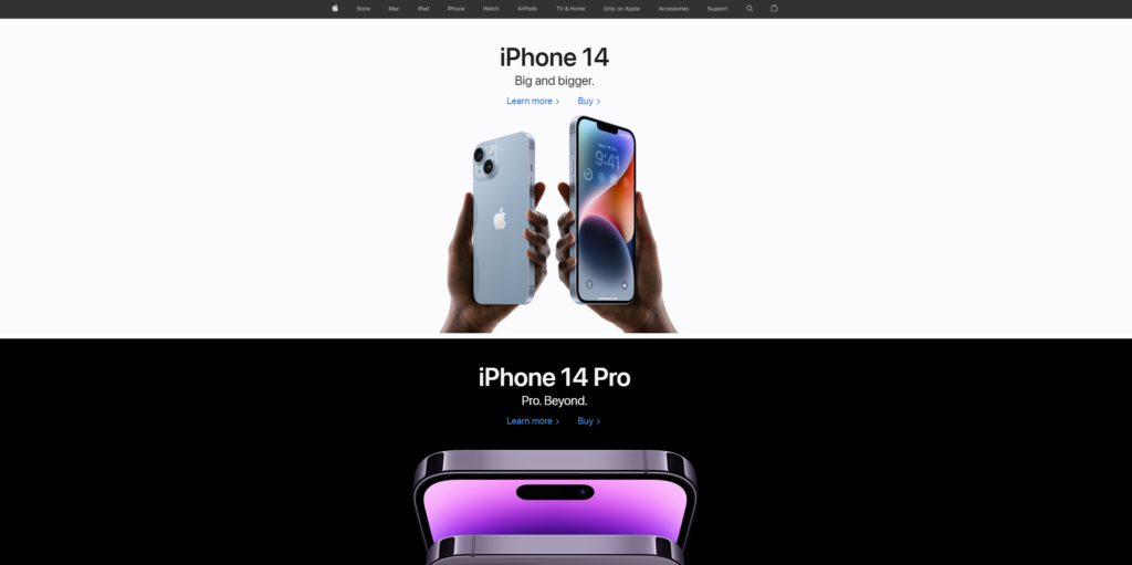
Use imagery and graphics
Images and any form of graphics can break up a body of text and keep readers invested.
They help set the mood for your content and can carry a message more effectively than a couple of sentences.
Your brain acknowledges images quicker than it will process text, so it makes it easier to skim read.
With good design, any form of illustration can improve the user experience and bring new life to your content.
Negative space
Isolating something makes it stand out much more, so doing it to important snippets of your content will help create impact.
Negative space can be scary to use in designs, as you don’t want to leave anything looking blank or forgotten about.
If done incorrectly, it can look a little lazy.
But good use of negative space improves the reader’s ability to skim read and can set a calm, minimalist tone.
Let the elements of your design breathe.
Consider eye/reading patterns
When reading a page of content, your eyes will follow certain patterns.
It’s a given that everyone will start at the top left of the screen, which is why it’s a great spot to put your logo.
After you start at the top left, where do you go?
The most popular pattern for skim reading is following a ‘Z’ or an ‘F’ pattern.
The ‘Z’ pattern is a zigzag, where they will dart back and forth while descending down the page.
The ‘F’ is a little bit more human, as they will skim the first couple of lines more deeply, then give up and look down at the beginning of the lines to find what they are looking for.
In terms of text, this is important to keep in mind, but visual design can benefit from this too.
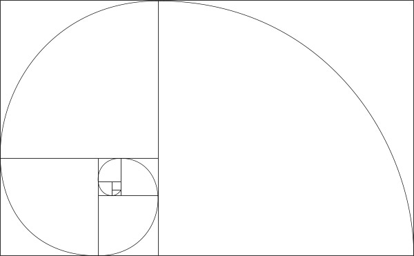
You can also use the ‘golden ratio’ in visual design, opting for an almost spiral-type pattern.
For more advice on web design, contact our team and see how we can help you.