Share this article
First impressions
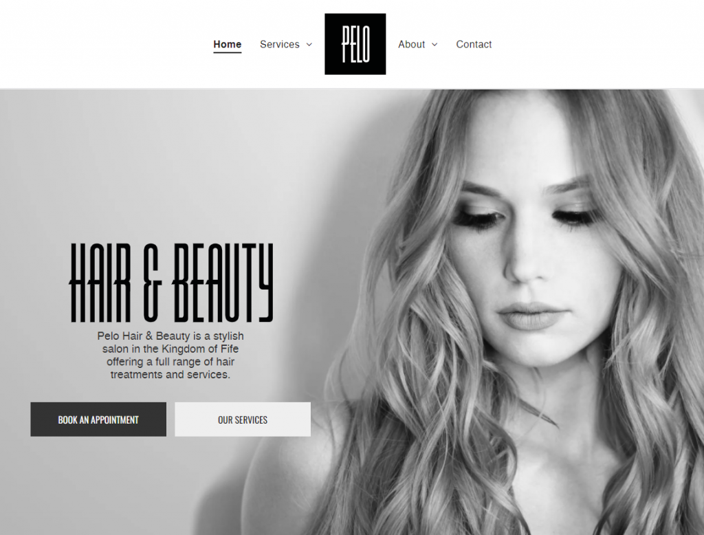
The owner of Pelo – a Fife hair salon – came to PageNorth Digital with an outdated website and brand.
Pelo has grown to be a highly respected salon due to its luxurious hair and beauty services, as well as countless happy brides.
Mary, the salon owner, wanted to modernise her business and give it a fresh appearance – from the logo and branding to the website and the marketing.
Here at PageNorth Digital, we work with new start-up businesses (as well as established companies) who are looking to revitalise their brand identity, whether it’s a new website or, as in this case, a full redesign.
Like all of our new clients, we started with an onboarding process.
Onboarding allows us to gather the basic information as well as the nitty-gritty of what our client wants and needs from us. We use this as a starting point to build the desired online presence.
Research
The first step is branding.
Mary had given us some pointers on the type of corporate identity she wanted for Pelo, describing it as “classic and timeless” but “nothing too fussy”. We took this to mean minimalist.
Before we start with any designing, we must research. This includes the name, target audience and competition within the market.
Pelo is the Spanish term for hair. This makes sense as Pelo is a salon, but it’s still important to look into the background of a brand name rather than make any assumptions.
In terms of competition, we need to know what competitor branding looks like. This is for two reasons:
One, to make sure that the logo and branding isn’t too similar to others – themes are often repeated within the same sector. The second is to see how others are communicating their brand and if it’s effective.
The look and feel it deserves
Target audience research is another key consideration.
If the client’s business is specifically aimed at women, there are certain design styles and approaches you wouldn’t use. It’s the same if a product is designed for child – you’ll make sure it’s appropriate for the age group it’s targeted at.
Once we’ve gathered all of this information and taken the answers from the client in the initial onboarding process, we’re fully equipped to give the brand the look and feel it deserves.
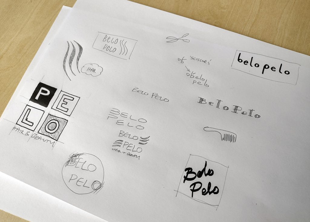
First drafts
The logo design process starts the way every creation should, with a pencil and paper. This is the most effective way to get ideas flowing and to see what works and what doesn’t.
Our design team will hash out as many ideas as possible, then have a meeting to discuss the common themes between each staff member’s contributions and which ideas should be taken forward.
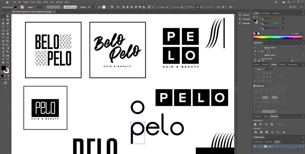
Using the rough sketches, we produce digital prospective logos for the first draft.
Regardless of the client, we always work in black and white at the start.
This allows us to focus on the shape and form of the logo and stops any bias during the selection process due to the colours used in a particular design.
All PageNorth Digital logos (as well as web graphics, in most cases) are produced in a vector format, as opposed to bitmap.
A bitmap image is created with a grid of pixels. We start with a blank canvas and a white square.
Because it’s a bit-map (a map of bits) we can break this block down into 800 rows and 800 columns of pixels. We can now colour each individual dot to make an image – a digital mosaic of sorts.
The more dots you have, the higher resolution – similar to 720p and 1080p when working with video.
The difference with bitmap and vector is that once you’ve created your image in bitmap, it’s set at the size you create it at.
We can scale down a bitmap image without losing much quality, but scaling up is where we start to lose detail and the image may become distorted. So, how do vector graphics get around this? With a mathematical formulation, of course!
When we draw a triangle within a vector image, instead of colouring in pixels to make the shape, the computer stores all 3 angles of the triangle and the length between them relatively, so not only does this allow us to scale up and down without losing any quality, it also generates files much smaller than their bitmap alternatives.
The real magic happens once we start working digitally.
After scanning the relevant sketches, our team gets to work on creating digital versions – this is when we really start to see what could work and what wont.
Sometimes we can find solutions to issues within a logo and fixes that aren’t achievable with pen and paper.
Once each team member has submitted their logo designs, we hold a meeting and decide what we’ll present to the client as first drafts.
This is a fun meeting for the designers – they get to collaborate, discuss each other’s work and get feedback from their peers.
The head of the design team has final say and then compiles a PDF for the client.
Presentation
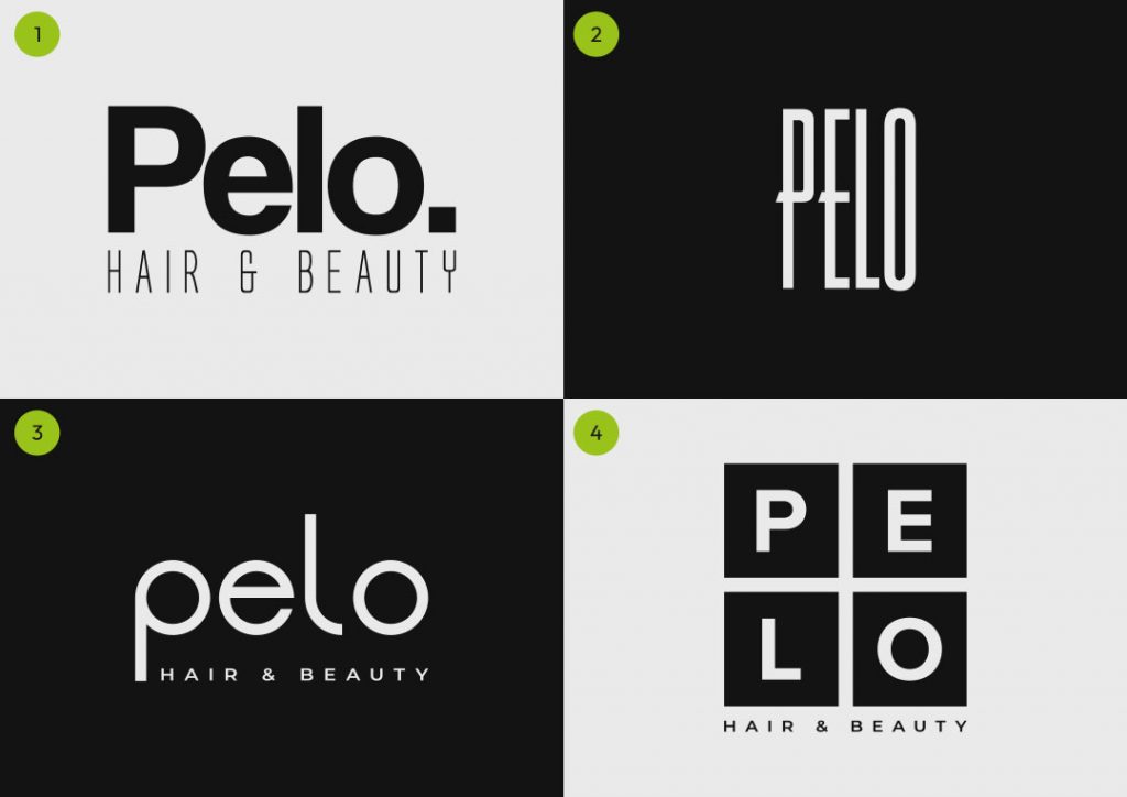
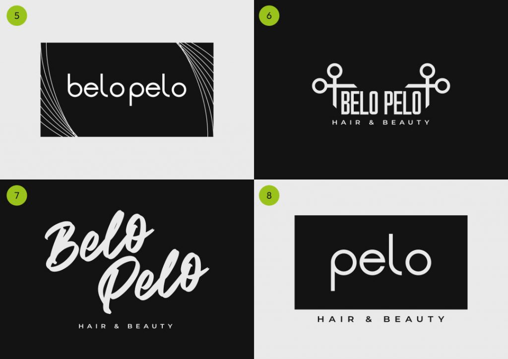
We present the logos in a clean black and white document, numbered to make it easier for the client to address each design when giving feedback.
For the record, there was a discussion with our client about the name of the business, as it could have been ‘Belo Pelo’, which translates to ‘beautiful hair’, or just ‘Pelo’, simply meaning hair.
She decided to leave this open and to see logo’s including both versions of the business name – the decision could be made based on our designs.
Once the PDF has been sent to the client, we wait to hear back.
The office favourites were No.5 and No.3, both different variations on the same basic wordmark. The lines at each side of No.5 are supposed to represent hair (as suggested by our youngest apprentice).
Outcome
After sending the logos to the client, she decided on a final design from the first draft document, something that is very rare.
She didn’t want any changes, and as it was a black and white logo that she’d requested, she was happy for us to pass this on to the website development team to allow work to begin on her website.
Here at PageNorth Digital, we pride ourselves on our accommodating service. We always communicate and allow as much client involvement in the design process as possible so that we can produce exactly what’s required.
Consistent communication and feedback throughout the design process can make a world of difference to the final product and a client’s rapport and trust.
Contact our team for more information about our Graphic Design services, be it corporate identity, brochure design or bespoke graphics.