It's more important than ever for businesses to have a website that looks great and functions well on a variety of devices and screen sizes. This is why responsive web design is now essential for any new website.
It's more important than ever for businesses to have a website that looks great and functions well on a variety of devices and screen sizes. This is why responsive web design is now essential for any new website.
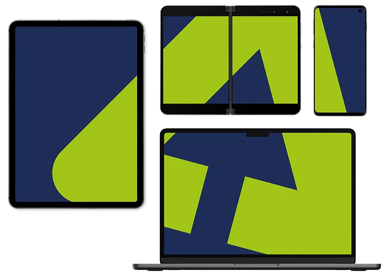
Responsive web design is an approach to web design that makes sure your website is optimised for all devices and any screen size. From desktops to smartphones, and everything in between. We ensure your website is responsive by using flexible, fluid grid layouts and flexible media. A responsive web design will adjust to the screen size it's being used on, making the viewing experience optimal for the user no matter their device.
Responsive design isn't fully dictated by the layout, the content also matters. When we design your responsive website, we make sure to always consider the structure of your content so that it is easy to read and navigate, even on smaller screens.
Responsive web design provides a much better experience for your users, but it also has an impact on SEO (Search Engine Optimisation). Search engines will prefer responsive websites over separate mobile websites since responsive design makes it easier for the search engine to crawl the site and index content.
Responsive web design is also a more cost-effective solution for your business. Rather than paying for the design and development of multiple websites for different devices, one website will work for all. This also makes maintenance much easier, saving you time and money.
