Share this article
Shortly after 5am on 18th April 1906, a 7.9 magnitude earthquake and subsequent fire devastated San Francisco and left the two Levi Strauss factories and headquarters in ruins.
The company designated a new temporary office at the home owned by Abraham Stern – Levi’s nephew – located at 1966 Pacific Avenue.
The makeshift premises served the needs of the business until a new Valencia Street factory was constructed in November 1906 and new headquarters were set up on Sixth and South Streets in 1907.
The company moved to 98 Battery Street in 1908, it remained the headquarters until 1973.
Koveralls
1912 saw Simon Davis, son of Jacob, invent ‘Koveralls’ – a one-piece play suit to “Keep Kids Kleen”. It was an adventurous new offering given that Levi Strauss & Co. was known for workwear.
Koveralls soon became one of the company’s most popular garments and their first nationally distributed product.
Eight years later, a new factory was opened to make Koveralls in Frankfort, Indiana.
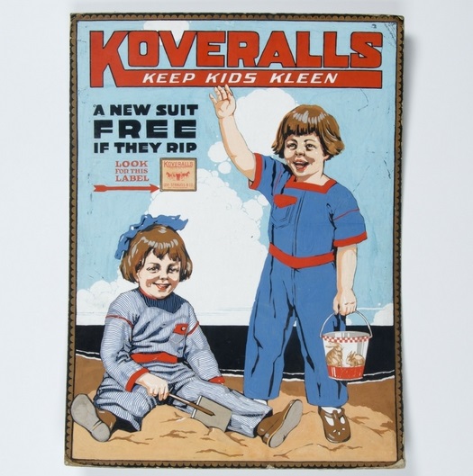
Notice how ‘Levi’s’ is still not a term used in the advertising. As well as the Two Horse overalls, Koveralls were simply a product that arrived in shops from a dry goods wholesaler.
The first logo
By the 1920s, Levi Strauss & Co. waist overalls were the top-selling men’s work pant in the United States.
Changes in men’s fashions and the demands of consumers saw belt loops added to the overalls in 1922. The suspender buttons and the cinch remained.
Some people recognise the bold slab serif display font that adorned the Battery Street headquarters as the first Levi Strauss logo. And there is, of course, the Two Horse emblem – more a stamp of quality than a logo as such.
The first purposefully designed logo came about in 1925 with this red, elongated sans-serif typeface with a black outline.
The hand-painted font has hard corners on the L, E and R with rounded ends. The full-bodied capital letters make for an imposing brand, but the softened angles give it a friendly, approachable feel.
Because it’s hand-painted, there’s slight discoloration where the texture is uneven. There’s also bleed between all of the letters except for the T and R.
The term ‘Levi’s’ still wasn’t a brand just yet, but that would come in 1928 when the company registerd the word ‘Levi’s’ as a trademark.
The Great Depression
By 1929, 70% of the firm’s profit derived from the sale of Two Horse waist overalls.
The stock market crash and subsequent Great Depression saw Levi Strauss & Co. fall on hard times. In particular, manual laborers – the people buying 501 waist overalls – were hit hard with widespread unemployment.
By 1930, sales had fallen one-sixth. To avoid layoffs, the company amassed a large backlog of unsold products and put its Valencia Street facility staff on a three-day work week.
By 1932, company sales had dropped to half of their 1929 level. The following year saw the Depression start to ease and sales of Levi’s began to recover.
Registered as a trademark the previous year, the second purposefully designed logotype emerged in 1929 and was the first to feature the term ‘Levi’s’.
The bold, silk-screened, geometric, sans-serif capitals made for an imposing appearence.
The white would have been the paper, there were then three ink layers: blue lettering, white shadowing to the left, black shadowing to the right and a solid red background.
Note the square appearence of the apostrophe due to the white shadowing in contrast to the rounded black shadowing. The arm of the ‘E’ is much slimmer than the rest of the composition.
The equidistant wide tracking of the ‘America’s Finest Overall’ tagline in dark blue capitals has a more standard, formal feel to make the message clear.
The Depression resulted in Western ranchers, unable to support themselves through agriculture, turning to tourism in the mid-1930s. They invited easterners to visit ‘dude ranches’ where a pair of 501s was standard workwear for the cowboys.
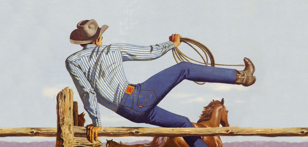
The popularity of Hollywood western movies gave big screen exposure to Levi’s. To capitalise, the company adopted the cowboy as its advertising and image-building icon, associating the rugged individualism with the 501 waist overalls.
Lady Levi’s
In 1934, a powerful message was sent: Levi Strauss & Co. championed women and their ability to do ‘men’s work’.
A female in overalls was not accepted as mainstream dress. Western women had been borrowing men’s 501s for years until ‘Lady Levi’s’ finally hit the market – a bold move for the time.
In 1936, National Sales Manager Chris Lucier came up with the idea of a distinctive new characteristic to set a pair of Levi’s apart from the many competitors who were copying the arcuate pocket stitching.
The Red Tab
1st September heralded the use of a folded red cloth ribbon which was added in the seam of the rear patch pocket. The word LEVI’S® in sans-serif capitals was woven in white.
It also featured on Levi’s jackets from 1937. “Look for the Red Tab” featured on a variety of advertising in the 1940s and 1950s.
Further modifications would take place with the back pockets now being sewn so that they covered the rivets preventing damange to furniture and saddles. The suspender buttons were removed, but consumers were given snap-on buttons in case they still wanted to wear suspenders.
World War II
As the 1930s drew to a close, Levi’s were gaining popularity as a fashion item. However, the American government declared jeans an essential commodity for the World War II effort and they became available to defense workers only.
By the end of the decade, African-American workers at the company’s California plants were working in integrated facilities.
A new logo in the early 1940s saw the continuation of elongated, sans-serif block capitals. This time, ‘Levi’s’ was painted in royal blue with a pale yellow background.
‘America’s finest overall’ continued to be the tagline, this time in grey (despite the green appearence in the image above). A black outline is visible.
Note the solid appearence of the royal blue lettering in contrast to the patchy texture of the rather ham-fisted tagline where the painting is more intricate. The two apostrophes point in different directions.
The elementary, triadic palate of dark lettering on a light base makes for a straightforward, no nonsense message.
Profits top $1 million
In 1947, the cinch was removed and the arcuate was stitched with a double-needle machine giving it a diamond shape at the point where the two lines meet.
In 1948, company profits topped $1 million for the first time on sales of four million pairs of waist overalls. Levi Strauss & Co. discontinued its wholesale business in order to concentrate on the highly profitable manufacturing of apparel.
A scarlet-red hue was adopted for the next logotype in 1949.
“when there’s work to be done, wear LEVI’S” was the slogan. The black lettering at the foot says “a new pair free if they rip”. The Two Horse emblem in blue and white is just recognisable in the image above.
The theme of the word ‘Levi’s’ in bold capitals continued, as did the unfussy nature of the message: no nonsense, quality workwear that’s durable.
One of the most obvious differences from the previous two logos is the use of lower case, note that the first letter of the upper tagline is deliberately not capitalised.
Similar to the previous logos, the composition is neat, tidy and direct. The upper tagline font has no descenders making for a clean baseline.
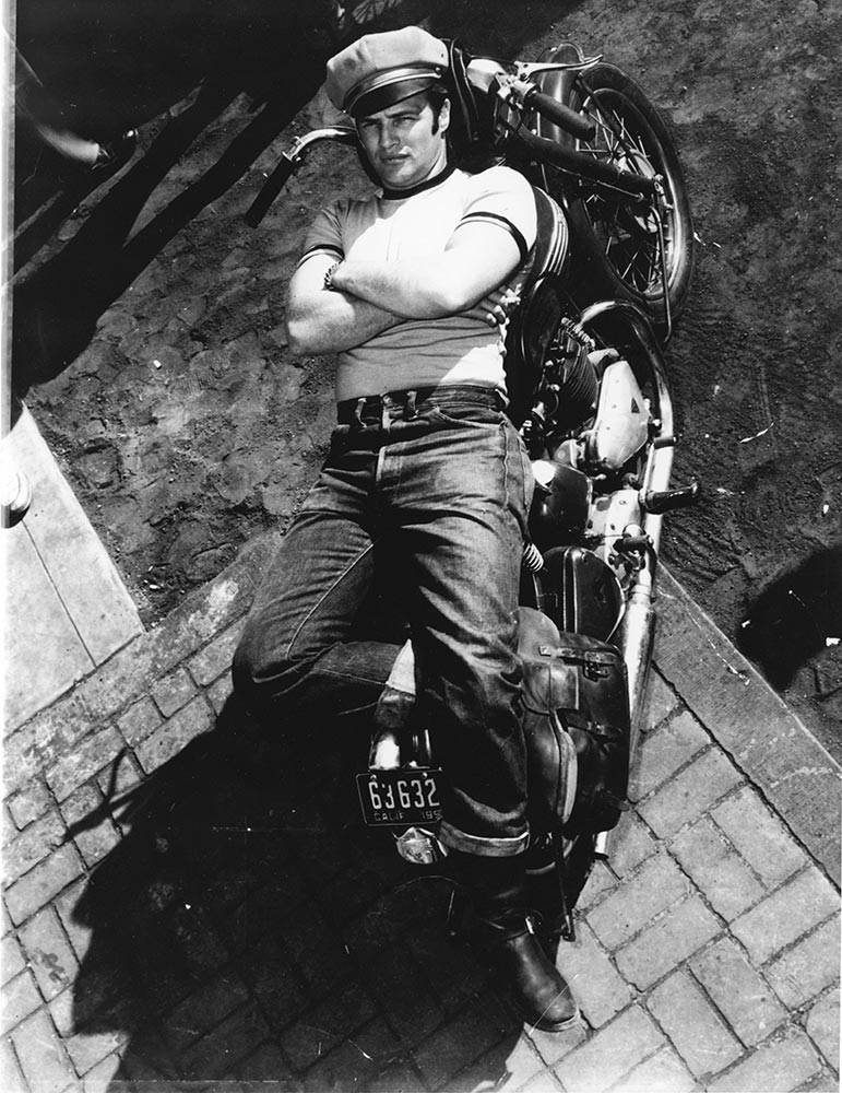
The combination of a booming post-war economy and 1950s Holywood led a significant transition from workwear to fashion.
Overalls were losing their rugged cowboy status and fast becoming a symbol of youthful defiance toward the adult world.
Characters played by Marlon Brando and James Dean in The Wild One and Rebel Without a Cause personified the rebellion of confused and alienated teenagers. Levi’s – as worn by Brando and Dean – had become the uniform of a disillusioned generation.
To gain wider appeal, the company added zip flies to 501s (as opposed to the traditional button fly) in 1954.
This more modern-looking redesign in 1954 established red as the main brand hue.
The same minimalistic principles apply with ‘LEVI’S’ in bold.
Kerning plays a big part in this design. The capitals feature an aslant ‘E’ leaning back into the ‘L’ whilst complementing the left arm of the ‘V’.
The ‘L’, ‘E’ and ‘S’ all feature softened angles for a sleek, stylised feel.
Note that the apostrophe is far more pronounced than in previous logos. It’s shape helps the overall squared-off appearence of the inscription.
This logo signalled the transition from workwear to fashion. Levi’s were no longer promoting duribility, this logo is a strategic shift to promoting style.
The words ‘Vintage Clothing’ appear under the brand name in a traditional bold, capitalised sans-serif font. A registered trademark symbol features for the first time.
Red invites action and expresses intensity. It represents passion and energy and evokes confidence, love and power. White represents clarity, cleanliness and simplicity.
Jeans
By the end of the decade, Levi Strauss & Co. was growing fast and profits were robust. 20 million pieces of clothing a year – half of them overalls – were being sold.
The word ‘jean’ started in the 1800s in reference to a twill cotton cloth used for trousers. But the textile soon became conflated with the garment it was commonly used for.
Others speculate that when tent canvas was replaced with a heavy blue denim material called ‘genes’ in France, the word became ‘jeans’ in America.
1960 saw the word ‘overalls’ replaced by the word ‘jeans’ in all Levi Strauss & Co. advertising and on labels. Teenagers, now the target audience, colloquially adopted the phrase in the 1950s and it became the term used by all manufacturers.
In an effort to build on its reputation and diversify its range, the early 1960s saw Levi Strauss & Co. experiment with different products.
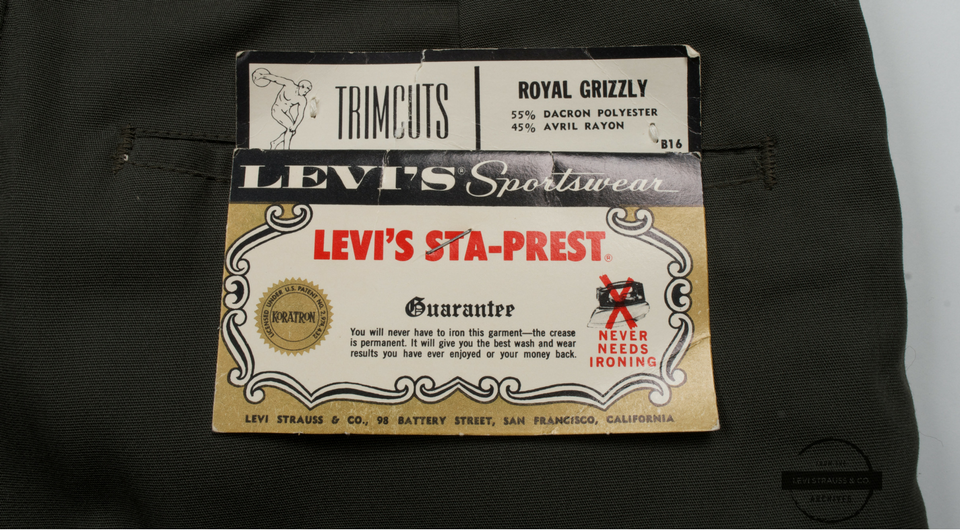
‘Orange, Lemon and Lime’ pants, in six bold colors, were a short-lived hit. Other new lines inclued beige twill Levi’s (marketed as ‘White Levi’s’), stretch denim and Sta-Prest.
Counter-culture continued to fuel sales for Levi Strauss & Co. and demand for jeans outstripped supply. By 1966, sales had doubled in three years to $152 million.
That year, a $20 million loan was negotiated to finance expansion. Offices and factories were set up throughout Europe and Asia leading to the formation of Levi Strauss International and Levi Strauss Far East. A division to produce and market women’s clothing was also established.
That year, the company aired its first television commercial.
Cool factor
501 rivets eventually wore through the denim, exposing them and causing problems with scratching furniture (which led to them being covered back in 1937). The rivets were removed from the back pockets in 1966 and replaced with bar tacking.
Entering the ‘Summer of Love’ in 1967, Levi’s were a cultural icon.
Upping their own ‘cool factor’, bands such as Paul Revere and the Raiders and The Jefferson Airplane recorded radio commercials for the Stretch Levi’s and White Levi’s lines.
Walter Landor (1913-1995) was a German expatriate who settled in San Francisco (sound familiar?).
In 1941, he founded Walter Landor & Associates (later renamed Landor Associates). It would soon become one of America’s leading packaging design firms working with clients such as Del Monte, Bank of America, Marlboro, Coca-Cola and Fuji Film.
In an effort to refresh the brand image, the ‘Batwing’ logo was designed by Walter Landor in 1967. The “youthful, yet timeless” emblem would go on to be used in the company’s branding from 1967 until 2003.
The ‘Batwing’ has the same pantone as the red tab. Previous logos featured the word ‘LEVI’S’ in all capitals, but Walter Landor suggested that the brand should have the founder’s name written properly, with a capital ‘L’ only.
Until now, the word ‘Levi’s’ had been placed inside rectangles of various sizes.
This logomark was a flat geometric trapezoid. The aslant parallel sides represented the same shape and proportions of 501 back pockets, the lower part had two arched arcuate indentations.
The trapezoidal shape – expressing a sense of stability – features a modest sans-serif front. The ‘e’ and the ‘s’ slightly exceed the x-hight.
It’s often written that the letting of the Batwing is all capital except for the ‘e’. However, only the ‘L’ is capitalised, it’s the same mean line for all of the letters.
As with previous inscriptions, the use of the apostrophe is not to be underestimated. The elongated, curved appearence helps the overall styling of this neat, calm and confident composition.
Eventually (in 1971) the woven letting on the red tab was changed to match the Batwing – capital ‘L’, lower case ‘e’, ‘v’, ‘i’ and ‘s’.
As the decade ended with the introduction of bell bottoms, sales nearing $200 million saw the company rank in the top six largest clothing manufacturers in the United States.