Share this article
When designing your website, you need to find the perfect balance between staying true to your brand, and not falling behind the curve with web design trends and best practices.
You should never blindly follow the current trends you see without any consideration of how it reflects your business.
But there is definitely some inspiration you can take from trends, some may work for you, and you can even adapt some to be more personalised.
You want to ensure that your website doesn’t look dated and boring, or your user retention can plummet.
So, let’s have a look at some of the current trends in web design, and how they can improve your online presence.
What are some of the main web design trends for 2023?
- Bold and colourful designs
- 3D elements and graphics
- Dark mode
- Minimalism and whitespace
- Micro-interactions and animations
Bold and colourful designs
A bold and colourful design will catch the eye of your viewers and keep their attention.
If you want to make an impactful first impression, this design style will help you stand out from your competitors.
It can also be good for user engagement and encourage your visitors to spend more time on your website.
When you create an aesthetically pleasing design with a good colour palette, your business can provide a more immersive and enjoyable user experience.
It’s also an effective medium for solidifying your brand’s appearance.
Using your brand’s colour palette will reinforce your recognisability and brand identity to the user.
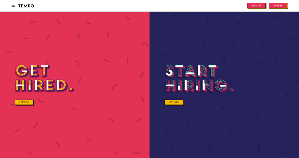
Hey Tempo is a job-hunting website that uses a bold and colourful design.
The website has a cartoon-style design and features lots of colourful and exciting fonts, buttons, imagery, and illustrations.
The website is eye-catching and fun, overall.
3D elements and graphics
Using 3D elements and graphics on your website helps create a more immersive experience for the user.
When interacting with your site, 3D elements can make the interactions appear more tangible and real.
It enhances the overall visual appeal, making your website stand out and adding an extra layer of interest to the full design.
One great benefit of 3D elements is the effect it has on storytelling, as it brings the narratives to life on the page.
This is also reflected in product visualisation, if you’re selling your products on your web store, 3D graphics help the shopper see the product fully and from all angles, giving them a better understanding of its appearance and features.
Lastly, it’s creative!
There are loads of possibilities you can take when using 3D elements in your design, allowing for unique and memorable user experiences.
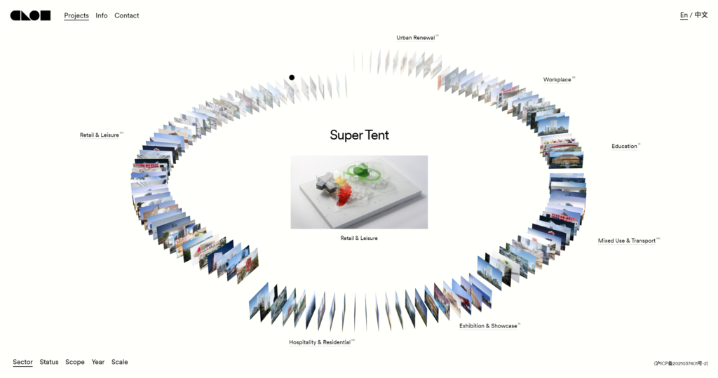
Clou provides a large range of services and showcases this using a 3D interactive carousel of everything they do.
This fluid and sleek design reflects their brand perfectly and is fun to use.
Dark mode
Most of us at PageNorth prefer to use dark mode on our devices, whether it’s mobile or the computers we use daily.
Dark mode isn’t a new concept when it comes to websites, the first computers operated on dark mode! (Illuminating the entire screen would burn the screen, but we can pretend it was a creative choice)
Allowing your users to switch between light and dark can improve the experience for them greatly.
It can help the users read your content with ease, as some prefer reading with a certain background, and dark mode can help with eyestrain in general.
As well as individual experience, you can use dark mode to convey a message.
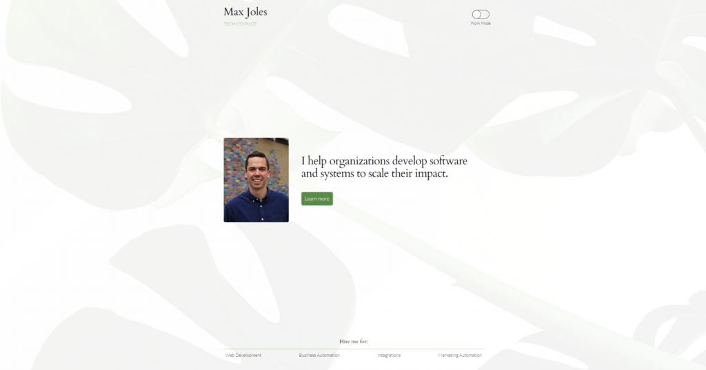
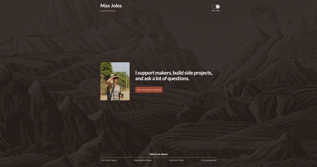
My favourite example of dark mode in web design is Max Joles, who uses his website to showcase the tech services he provides.
Toggling light and dark modes actually show his two ‘different sides’.
Light mode is the more professional work, with a picture fit for LinkedIn, and a headline perfect to attract businesses looking for help.
The dark mode is showing his creative side, with a more fun image, headline, and services that are less corporate and non-code oriented.
Minimalism and whitespace
Minimalism and whitespace can provide the user with a sense of ease.
It gives off a more professional, calm, and refined energy.
It’s also great for bringing attention to what you really want the user to be looking at, minimal clutter means minimal distraction.
It’s easy on the eyes and appeals to specific customer personas.
Many people find it easier to consume the content on your site if it’s presented in a minimalistic style, and it can also make navigation quick and easy.
We’ve all heard that sometimes more is less, so keep your website balanced with minimalism and whitespace.
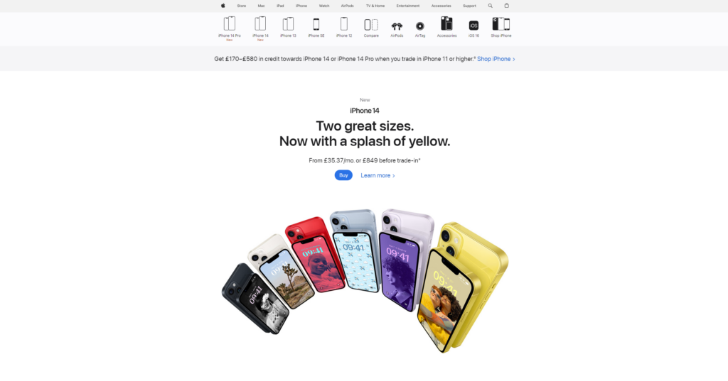
Of course, Apple almost always gets a shoutout when we write about whitespace.
Their website is uncluttered, with a minimalistic white background and plenty of breathing room around the main attraction; the products.
They do a great job of keeping your attention on the product on the screen, and the site has a modern and straightforward feel to it, while also feeling futuristic and innovative.
Micro-interactions and animations
Have you ever found yourself browsing a website, and repeatedly hovering or clicking on a page animation to see a micro animation?
It’s an incredibly simple way to keep people immersed in your website and improve their experience overall.
Using any form of animation is helpful if you want to show multiple elements in the same area, to avoid taking up too much page room.
But it also can just be fun!
It feels advanced and very current.
Like 3D elements, if you are selling products on your website, animations can give the user a good idea of what it looks like, how it functions, and the general features of what you are selling.
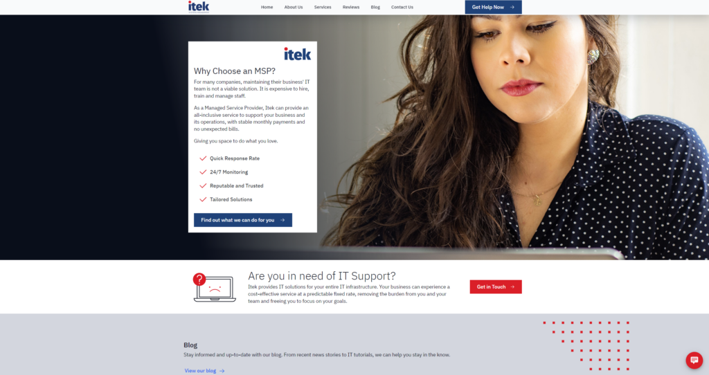
Itek uses its website to show the IT managed service provider services they provide and uses a range of micro-interactions on its site, to passively keep the user engaged while scrolling.
There is movement all over the homepage, without it being overwhelming or disorienting.
Simple messages are conveyed through micro-interactions, such as a sad-looking computer getting a smile when you hover over the contact button.
Of course, there are plenty more trends we’ve seen this year so far, but that’s just some of our favourites.
When updating or building your website from scratch, you can take inspiration from these trends, but you have to remain true to your brand.
You also have to ensure your website is usable and accessible, even when implementing exciting new design aspects.
This can be stressful, which is why working with a web design agency can really help you make sure your website is perfect.
If you need help building your website, we have a team of experts more than happy to help.
Contact our team and see what we can do for you.